Exploratory Analysis of Police Violence in the US
Police Killings Over Time 2013-2019
year_plot =
  mpv_df %>%
  count(year) %>%
  rename(total_killed = n) %>%
  filter(year < 2020) %>%
  ggplot(aes(x = year, y = total_killed)) + geom_point() +
  geom_smooth(method = lm, se = FALSE) +
  scale_y_continuous(limit = c(0, 1400)) +
  labs(y = "Total People Killed",
       x = "Year")

year_plot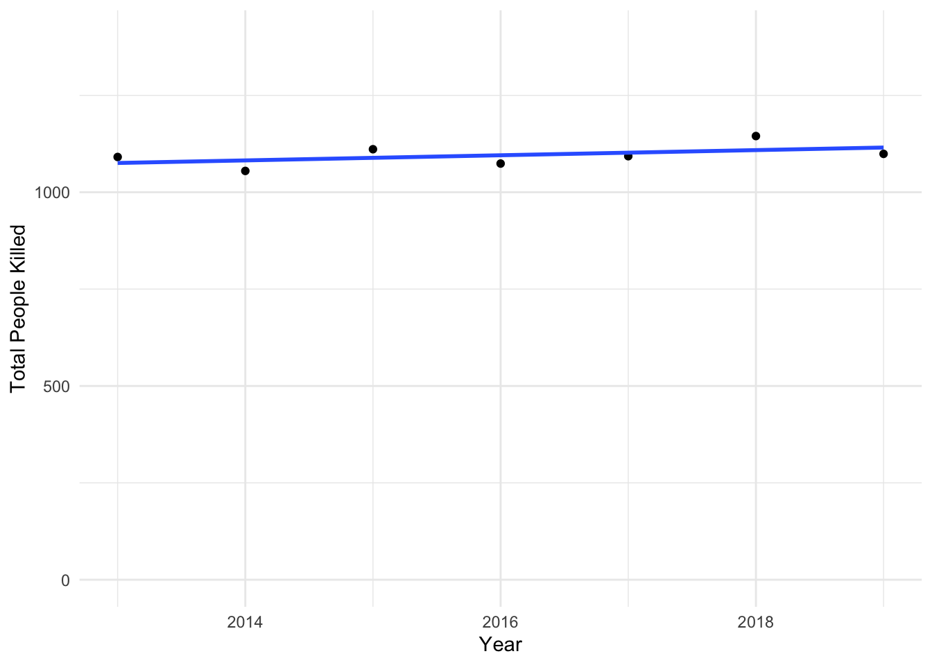
The plot above shows the total number police killings per year from 2013 through 2019. As displayed in the plot, the total number of killings has remained relatively unchanged the past 6 years despite increased public awareness of police brutality. We should also consider the possibility of error in classification due to cause of death, and potential for cases to not be classified as police violence.
Proportion of Police Killings over Time by Race
race_pop_df =
  read_csv("./data/race_pop_df.csv")

scatter_df =
  mpv_df %>%
  mutate(
    race = str_replace_all(race, "unknown race", "Unknown race")
    ) %>%
  filter(year < 2020) %>%
  group_by(year, race) %>%
  count()

anim_scatter2 = left_join(scatter_df, race_pop_df, by = c("year" = "year", "race" = "race"))

anim_scatter2 =
anim_scatter2 %>%
  mutate(
    proportion = (n/population)*100000
  ) %>%
  drop_na() %>%
  ggplot(aes(x = year, y = proportion, color = race)) +
  geom_line() +
  geom_point() +
  labs(title = "Proportion of Police Killings by Race (2013-2019)",
       x = "Year",
       y = "Deaths per 100,000") +
  transition_reveal(year)

animate(anim_scatter2, renderer = gifski_renderer())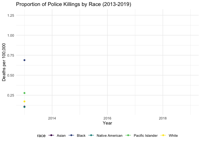
This plot shows the number of deaths per 100,000 due to police intervention from 2013 through 2019 by race. From this graph, those identifying as Black, Native American, and Pacific Islander are subject to the greatest proportion of police violence. This relationship holds relatively steady throughout this time period; people identifying as Pacific Islander represent the greatest proportion of deaths. This finding is consistent with recent findings showing that Black people are disproportionately affected by police violence in comparison to white folks. A limitation of this plot is that it does not include the Hispanic population as a separate group. This is because the population counts came from the US Census, which classifies Hispanic as an ethnicity and is thus not included in the racial information.
US Population by Race vs. Persons Killed by Police by Race/Ethnicity
total_race =
  mpv_demo_df %>%
  select(-c(17:18, 21:35, 38, 40, 42, 44, 46, 48)) %>%
  pivot_longer(
    20:25,
    names_to = "total_race",
    values_to = "total_estimate"
  ) %>%
  mutate(
    total_race = str_replace(total_race, "am_in_alask", "Native American"),
    total_race = str_replace(total_race, "hawaii_pi", "Pacific Islander"),
    total_race = str_replace(total_race, "asian", "Asian"),
    total_race = str_replace(total_race, "black", "Black"),
    total_race = str_replace(total_race, "other", "Other"),
    total_race = str_replace(total_race, "white", "White"),
  )  %>%
  ggplot(
    aes(x = total_race, y = total_estimate, color = total_race, fill = total_race)
  ) +
  geom_bar(stat = "identity") +
  theme(
      axis.text.x = element_text(angle = 45, vjust = 0.5, hjust = 1),
      legend.position = "none") +
  labs(
    x = "",
    y = "Total"
  ) +
  ggtitle("Total US Population Estimates by Race")

race_mpv =
  mpv_demo_df %>%
  mutate(
    race = str_replace_all(race, "unknown race", "Unknown race"),
    race = str_replace(race, "NA", "Unknown race")
    ) %>%
  filter(race != "NA",
         race != "Unknown") %>%
  group_by(race) %>%
  count() %>%
  ggplot(aes(x = race, y = n, color = race, fill = race)) +
  geom_bar(stat = "identity") +
  theme(
    axis.text.x = element_text(angle = 45, vjust = 0.5, hjust = 1),
    legend.position = "none") +
  labs(
    x = "",
    y = "Total"
  ) +
  ggtitle("Number of People Killed by Race")

total_race + race_mpv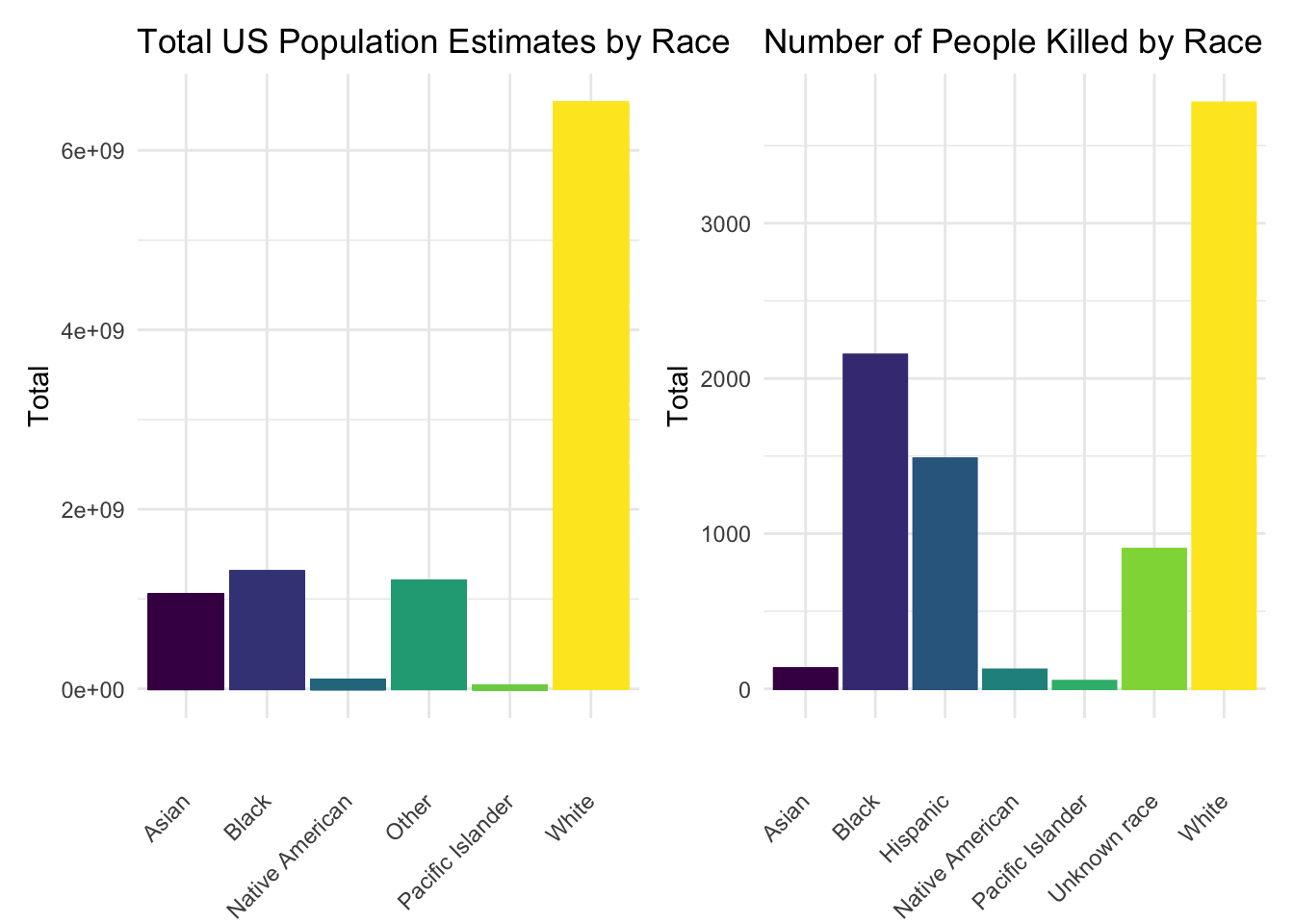
The above plot compares the total US population estimate by race according to ACS data (left) compared with the total number of people killed by police broken down by race (right). These plots further show the breakdown of race, as introduced in the previous plot, but do include those identified as Hispanic who were subject to police violence. As displayed in the plots above, a much higher proportion of those who are killed by police are Black when compared to the total US population. When analyzing these estimates as proportions, we find that white people are underrepresented in police killings and Black people are overrepresented.
Police Killings by State
mpv_df %>%
  count(state) %>%
  rename(total_killed_st = n) %>%
  arrange(desc(total_killed_st)) %>%
  mutate(
    state = factor(state),
    state = fct_reorder(state, total_killed_st)
  ) %>%
 plot_ly(
      y = ~total_killed_st, x = ~state, color = ~state,
      type = "bar", colors = "viridis") %>%
  layout(
    xaxis = list(title = "State"),
    yaxis = list(title = "Number Killed")
)
mpv_df %>%
count(state) %>%
rename(total_killed_st = n) %>%
arrange(desc(total_killed_st)) %>%
filter(total_killed_st >= 230) %>%
mutate(
state = factor(state),
state = fct_reorder(state, total_killed_st)
) %>%
plot_ly(
y = ~total_killed_st, x = ~state, color = ~state,
type = "bar", colors = "viridis") %>%
layout(
xaxis = list(title = "State"),
yaxis = list(title = "Number Killed")
)These two graphs show us the total number people killed per state from 2013-2020. The first graph contains numbers for all 50 states and the second graph contains the top 10 states with the highest number of police killings. At the top is California which is almost double the next highest state, Texas. It is notable that states among the top 10 when considering the most deaths due to legal intervention are not all the most populous states; as we can see from the graph, New York doesn’t classify as one of the top states with the most police killings, even though the NYS population is one of the highest. Again, we should consider limitations regarding classification of death as legal intervention.
Police Killings by Department
mpv_df %>%
  count(police_dept) %>%
  rename(total_killed_pd = n) %>%
  filter(total_killed_pd >= 49) %>%
  mutate(
    police_dept = factor(police_dept),
    police_dept = fct_reorder(police_dept, total_killed_pd)
  ) %>%
   plot_ly(
      y = ~total_killed_pd, x = ~police_dept, color = ~police_dept,
      type = "bar", colors = "viridis") %>%
  layout(
    xaxis = list(title = "Police Department"),
    yaxis = list(title = "Number Killed")
)
This plot depicts the total number of people killed from 2013 through 2020 broken down by police department; only departments with a count higher than 49 are included to show the highest offenders. Based on this graph, we can see that Los Angeles has the highest count, especially once the LA County and LA city departments are combined together for a total that is double the city with the second highest count.
Breakdown of charges laid against police
mpv_case =
  mpv_df %>%
  count(criminal_charges) %>%
  mutate(
    charges = case_when(
      startsWith(criminal_charges, "Charged") ~ "Yes",
      startsWith(criminal_charges, "No") ~ "No",
    )) %>%
  ggplot(aes(x = charges, y = n, color = charges, fill = charges)) +
  geom_col() +
  labs(
    x = "Charges Brought Up Against Police" ,
    y = "Total"
  ) +
  theme(legend.title = element_blank())

mpv_case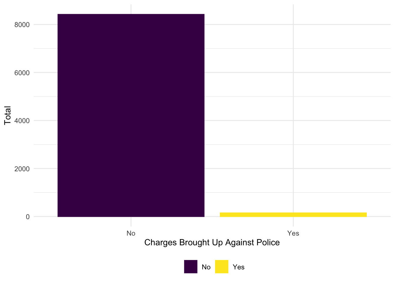
The above plot shows the breakdown of whether charges were pressed against police after each case. In total, 69 charges were brought up against police, compared to the 8420 cases where police were not charged.