Project Report
Motivation
This project is overall motivated by the killing of George Floyd in 2020 and the protests and demonstrations that followed. Police violence and violence against protesters has been a highly talked about issue in 2020 thus far and we were interested in finding and analyzing data related to police violence and the Black Lives Matter protests.
Motivating Sources
- “A crisis that began with an image of police violence keeps providing more” from NY Times - Link
- “Protests about police brutality are met with wave of police brutality in US” from NY Times - Link
- “How George Floyd’s death ignited a racial reckoning that shows no sign of slowing down” from CN - Link
Questions
The questions for this project are based on the 3 datasets we used that are listed in the next section:
- What is the spread of police violence over time and space, accounting for basic demographics?
- What were common characteristics of instances of police violence against individuals, including court rulings of the police involved?
- What is the geographic spread of Black Lives Matter demonstrations in the US during 2020?
- How does the spread of Black Lives Matter Protests relate to average income across states and cities in the US?
Data
Data Sources
- Mapping Police Violence in the US – Link
- ACLED US Crisis Monitor – Link
- American Community Survey – Link
- US Census – Link
Variables of Interest
Police Violence Dataset
agegenderracepolice_dept: the police department responsible for the individual’s deathyearcitystatecriminal_charges: whether the police officers involved received criminal chargessymptoms_of_mental_illness: whether the individual killed had symptoms of mental illness
Protest Dataset
monthevent_type: the type of event, ranging from protests to riotssub_event_type: the sub-type of event, including peaceful protestsstatecountyfatalities: number of individuals killed at each event
American Community Survey (ACS) Datasets
General
idcountystate
Income
total_incomeestimate_households: percent estimate for each county by total household incomemean_income: the mean income in each countymedian_income: the median income in each countydisparity_value: mean income - median income in each county, which was constructed in this analysisincome_class: ranges from “Very Low” to “Very High” based onmedian_incomevalue for each county, recoded in this analysis
Race
race: classified as white, Black, Asian, Native American, Pacific Islander, and othertotal: total estimate for each county for each race categoryprop: percent estimate for each county for each race category
US Census Data
Yearrace: classified as white, Black, Asian, Native American, and Pacific Islanderpopulation: Total population by race in millions.
Data Cleaning
The police violence and protest datasets were both similarly cleaned. The data was first imported into R. The variables were then renamed and selected based on if they were intuitive and if they were needed for this analysis. While the protest data already had a latitude and longitude included, an external source was joined with the police violence dataset so latitudes and longitudes of cities could be included in the dataset.
For the ACS data we looked at race and income; each category had their own separate datasets with a tidy and non-tidy version. Tidy datasets were used for visualization and exploratory analyses and the non-tidy datasets were joined with the Police Violence Dataset and Protest Dataset separately in order to conduct further statistical analyses and plotting. However, for both the tidy and non-tidy datasets: variable names were shortened for convenience and only a subset of of the original datasets’ categories were kept (for example, in all datasets ‘margin of error estimates’ were removed). Below are the specific data cleaning steps for each dataset:
- Race: This dataset excludes data for those who identify as more than one race. Additionally, proportion was calculated for each race category.
- Income: This dataset includes only the total percent estimates by household income. Variables for income class and a proxy disparity value were created from the mean and median income of each county.
Exploratory Analysis
ACS Data
The exploratory analysis for ACS data was used to provide preliminary context for current country demographics and supplement our analysis of police violence and protests throughout the country.
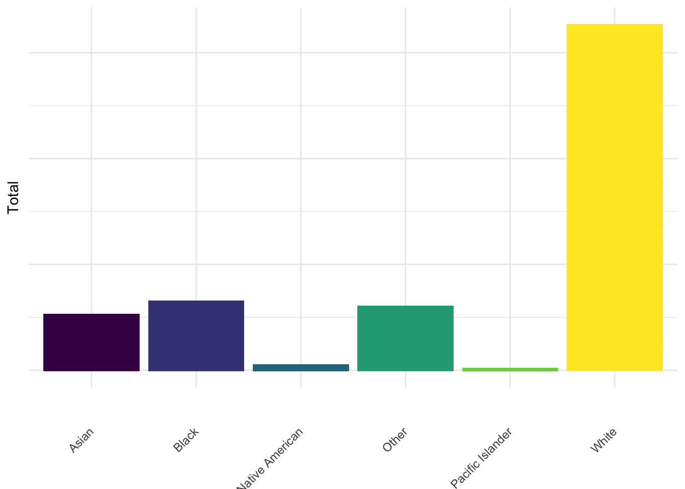
US Population by Race
This plot shows the total population of each racial group in the US in total and contextualizes the police violence data. Comparing the police killings by race to the total population by race shows us that proportionally, Black people have a higher likelihood to be a victim of police brutality.
mpv_demo_df %>%
  select(-c(17:18, 21:35, 38, 40, 42, 44, 46, 48)) %>%
  pivot_longer(
    20:25,
    names_to = "total_race",
    values_to = "total_estimate"
  ) %>%
  mutate(
    total_race = str_replace(total_race, "am_in_alask", "Native American"),
    total_race = str_replace(total_race, "hawaii_pi", "Pacific Islander"),
    total_race = str_replace(total_race, "asian", "Asian"),
    total_race = str_replace(total_race, "black", "Black"),
    total_race = str_replace(total_race, "other", "Other"),
    total_race = str_replace(total_race, "white", "White"),
  )  %>%
  ggplot(
    aes(x = total_race, y = total_estimate, color = total_race, fill = total_race)
  ) +
  geom_bar(stat = "identity") +
  theme(
      axis.text.y = element_blank(),
      axis.text.x = element_text(angle = 45, vjust = 0.5, hjust = 1),
      legend.position = "none") +
  labs(
    x = "",
    y = "Total",
    Title = "Total US Population Estimates by Race"
  )
Household Income in the US
This plot shows the mean household income in the US by state which helped inform our understanding of the distribution of and disparity in wealth across the US and provides some background for our regression analysis on the protest data.
# mean household income by state
income_df_tidy %>%
  mutate(
    state = fct_reorder(state, mean_income)
  ) %>%
  plot_ly(
      y = ~mean_income, x = ~state, color = ~state,
      type = "box", colors = "viridis")
Police Violence Data
The exploratory analysis for this dataset was primarily used to visualize the data and help in understanding the shape and geographic spread of the data.
Symptoms of mental illness charges against police (2013-2020)
The following map shows the geographic distribution of individuals killed by police between 2013 and 2020 by year, with information on symptoms of mental illness and whether the officer was charged included in the label. This map was used to determine the geographic spread of those killed by police each year from 2013 to 2020, and shows the small number of officers that were charged, regardless of killing individuals with symptoms of mental illness.
pal <- colorNumeric(
  palette = "viridis",
  domain = mpv_df$year)


mpv_df %>%
  drop_na() %>%
  mutate(
    lab = str_c("Symptoms of Mental Illness: ", symptoms_of_mental_illness,
                "<br>Charges on the Police: ", criminal_charges)) %>%
  leaflet() %>%
  addTiles() %>%
  setView(-98.483330, 38.712046, zoom = 4) %>%
  addLegend("bottomright", pal = pal,
            values = ~year,
            title = "Year",
            labFormat = labelFormat(big.mark = ""),
            opacity = 1) %>%
  addCircleMarkers(
    ~lng, ~lat,
    color = ~pal(year),
    radius = 0.5,
    popup = ~lab)
This informed the regression analysis we performed using the police violence data in the regression section below, along with the plot outlined below.
People killed due to police violence by race
The following plot displays the proportion of individuals killed by police from 2013-2020 by race. According to the data displayed in the plot below, the most killings have occurred among those identifying as Black, Native American, and Pacific Islander. This finding is consistent with recent findings showing that Black people are disproportionately affected by police violence. While the original MPV dataset contains information about those identifying as Hispanic, census data did not capture total population, thus making proportions not possible for this plot. This plot along with the map above were used in informing the regression analysis.
race_pop_df =
  read_csv("./data/race_pop_df.csv")

scatter_df =
  mpv_df %>%
  mutate(
    race = str_replace_all(race, "unknown race", "Unknown race")
    ) %>%
  filter(year < 2020) %>%
  group_by(year, race) %>%
  count()

anim_scatter2 = left_join(scatter_df, race_pop_df, by = c("year" = "year", "race" = "race"))

anim_scatter2 =
anim_scatter2 %>%
  mutate(
    proportion = (n/population)*100000
  ) %>%
  drop_na() %>%
  ggplot(aes(x = year, y = proportion, color = race)) +
  geom_line() +
  geom_point() +
  labs(title = "Proportion of Police Killings by Race (2013-2019)",
       x = "Year",
       y = "Deaths per 100,000") +
  transition_reveal(year)

animate(anim_scatter2, renderer = gifski_renderer())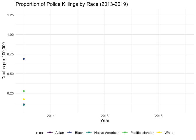
Protest Data
Demonstrations by State
According to the plot below, California by far held the most demonstrations, followed by New York state and Florida. This informed the regression analysis we performed using the protest data, and gave us the idea to examine this data along with ACS income data on the county level across the US.
protest_data %>%
  mutate(
    state = as.factor(state)
  ) %>%
  filter(event_type == "Protests") %>%
  count(state) %>%
  mutate(
    state = fct_reorder(state, n, .desc = FALSE)
  ) %>%
   plot_ly(
      x = ~state,
      y = ~n,
      color = ~state,
      type = "bar", colors = "viridis") %>%
    layout(
    xaxis = list(title = "State"),
    yaxis = list(title = "Number of Protests"))
Demonstrations Across the US by Income Class
This map shows the income level of the county where each protest occurred and provided useful visualization for the regression analysis conducted on the protest data. Note: some data was lost when combining income and protest datasets, as some counties present in the protest dataset were not present in the ACS income dataset.
protest_demo_df2 =
  read_csv("./data/protest_demo_df2.csv") %>%
  mutate(
    income_class = fct_relevel(income_class, "Very High", "High", "Middle", "Low", "Very Low")
  )

factpal3 <- colorFactor("magma", protest_demo_df2 %>% pull(income_class))
protest_demo_df2 %>%
  drop_na() %>%
  mutate(
  pop1 = str_c("City: ", city, "<br>Event Type: ",
               sub_event_type, "<br>Year: ", year, "<br>Fatalities: ", fatalities)) %>%
  leaflet() %>%
  addProviderTiles(providers$CartoDB.Positron) %>%
  addLegend("bottomright", pal = factpal3,
            values = ~as.factor(income_class),
            title = "Income Class",
            labFormat = labelFormat(big.mark = ""),
            opacity = 1) %>%
  addCircleMarkers(
    ~longitude, ~latitude,
    color = ~factpal3(income_class),
    radius = 0.5,
    popup = ~pop1
    )
Regression Analysis
Police Violence Data
Using this data, we opted to investigate two separate outcomes. The primary model explored whether race was associated with charges laid against police as a result of police violence. Logistic regression was used to investigate this association, as the outcome was binary. We included confounders in the model based on both a priori hypotheses and a >10% change in the estimate. Using these criteria, we adjusted for gender and recorded symptoms of mental illness. We then conducted a sensitivity analysis, excluding pending investigations which would have acted to produce misclassification of the outcome. Once we omitted pending cases, a similar association was observed between race and charges laid against police.
The second model assessed the relationship between gender and reported symptoms of mental illness as an outcome. Using the same criteria as outlined above for confounder selection. After adjustment for age and race, we found no significant association between gender and reported symptoms of mental illness.
Protest Data
We investigated protest information at the county-level, using count data which grouped the number of protests by county. Using the dataset linked with census data, we explored whether income class at the county level was associated with number of protests. Since we are interested in modeling count data, we employed Poisson regression with a log link function and no offset term. This model adjusted for population size at the county-level. Upon investigating model fit using overdispersion testing, we found that overdispersion was a concern for this model. Therefore, we ultimately fit a negative binomial model quantifying the association between income class and protest count, adjusted for county population size.
Discussion
Overall, the findings for the police violence data were not all consistent with what we had originally hypothesized. Descriptively, we found that the vast majority (98.3%) of police violence cases resulted in no criminal charges, which we had expected. Surprisingly, among people who had recorded symptoms of mental illness, only 0.8% of cases resulted in criminal charges to the officer.
While we did find that most of the cases did not result in criminal charges to the officer involved in the exploratory analysis, the analysis investigating the relationship between race and criminal charges revealed that officers involved in the killing of Black people were more likely to be charged. This could have been for reasons outside of what the data offered, such as these incidents being more frequently unjustified in cases involving Black individuals in comparison to white individuals. We also found that while white individuals had higher total numbers of deaths recorded than any other race, those identifying as Black were disproportionately killed by police. This is in line with many current findings showing. Ascertainment of misclassification was not possible with the data available.
The second model built investigated whether there exists a relationship between gender and recorded symptoms of mental illness. After adjustment for age and race, we did not find a relationship between gender and mental illness.
There were similarly unexpected but interesting findings in the protest data analysis as well. In the exploratory analysis we found that states with larger populations and large cities, including California, New York, and Florida, held the highest numbers of demonstrations which was consistent with what was expected. However, the Poisson regression analysis found that the “very high” income group was more likely to hold protests than other income groups. We thought that this could have potentially been due to the cities holding more protests in conjunction with having higher income classes, which would be consistent with the finding from the exploratory analysis. After adjustment for population size at the county-level in the original model, we found an association between higher income class and likelihood of holding protests.
However, after investigating model fit, we found that overdispersion was a concern in the original Poisson regression model. We then fit a negative binomial model to account for overdispersion, and adjusted for county-level population. Once doing so, we found that the only income class significantly associated with a greater protest count was the “low” income class in comparison to the “very low” income class. This is in line with what we had hypothesized; these results speak to the impact of available resources (in terms of both monetary and time), which may impact the ability to organize across counties. We hope that this demonstrates the importance of resource-mobilization, and the importance of making sure the voices of communities impacted by police violence are heard, if they may not be able to physically protest.
Limitations
Both datasets contained limited information, which prevented us from being able to adjust for variables we believed could be confounding the associations. In the case of the police violence dataset, the association between race and charges laid was the opposite from what we were expecting. We hypothesized that this could be due to motivation/reason for the initial police stop being less justified when the victim of police violence is Black. Ideally, we would have been able to analyze this relationship by reason for initial police contact. Additionally, we had small cell sizes for people of races other than white or Black when running the models, and thus restricted to individuals reporting race as white or Black. In terms of the model assessing income class and protest count, we were limited by the number of covariates available to include.
There was also a limitation in plotting race of the US population from the census compared to the amount of people killed by police broken down by race because the US Census excludes Hispanic individuals in the racial information. Lastly, we should consider the limitation that this data is not capturing (1) people affected by police violence in non-fatal incidents, and (2) the potential for a lack of reporting regarding death due to police intervention.
Conclusions
Overall, our findings were not completely consistent with what we had expected. While we expected the proportion of protests to be largely peaceful, a finding consistent with our hypotheses, we were expecting higher income communities to hold significantly more protests. We were not expecting charges laid to be significantly greater when considering Black victims of police violence, but suspect that this is due to data limitations. We also found that given the limitations in our datasets, we may have been missing information that could have benefited our analyses. Police violence data in the past has been somewhat inconsistent and therefore not always trusted, given potential for lack of record of individuals killed by police. However, given the events of 2020, we feel that the data, for the most part, was as complete as possible.